

+ Reply to Thread

Results 1 to 10 of 14
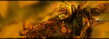
Thread: Resistance 2(For sotw)
-
09-23-2008 #1
- Join Date
- Jan 2008
- Location
- Your mom's fresh shaven Cun+.
- Posts
- 2,598
- Points
- 6,928,562.43
- Rep Power
- 237
-
09-24-2008 #2
- Join Date
- Feb 2008
- Posts
- 1,256
- Points
- 2,006,616.67
- Rep Power
- 227

heeyy actually that looks pretty good! i like it, its blended well. the flow is good!
i just think there should be some lighting and put ur name next to the face of the guy
Thanks Dillon_Ritual

Thanks CEREAL_MAN!

Thanks xWhite_Shadowx
Thanks CEREAL_MAN/J3LLO
Thanks +Mw.Kat~AV
Thanks STOP_B
Thanks MZA
Thanks -Sя.DoubleU
My Photobucket URL: http://photobucket.com/floppy
1000th Post!: http://www.codinghs.com/forums/showp...39&postcount=3
-
09-24-2008 #3
 GFX MASTER! BOW DOWN
Elite Contributor
GFX MASTER! BOW DOWN
Elite Contributor

- Join Date
- Apr 2008
- Location
- N0T NEAR Y0U
- Posts
- 1,512
- Points
- 3,639,999.70
- Rep Power
- 227
actually there is no flow u can try working on that also try looking at some text tuts


-
09-24-2008 #4
- Join Date
- Feb 2008
- Posts
- 1,256
- Points
- 2,006,616.67
- Rep Power
- 227
i like the direction of the flow but we r all entitled to our own opinions so oh well
Thanks Dillon_Ritual
Thanks CEREAL_MAN!
Thanks xWhite_Shadowx
Thanks CEREAL_MAN/J3LLO
Thanks +Mw.Kat~AV
Thanks STOP_B
Thanks MZA
Thanks -Sя.DoubleU
My Photobucket URL: http://photobucket.com/floppy
1000th Post!: http://www.codinghs.com/forums/showp...39&postcount=3
-
09-24-2008 #5
- Join Date
- Jan 2008
- Location
- Your mom's fresh shaven Cun+.
- Posts
- 2,598
- Points
- 6,928,562.43
- Rep Power
- 237
Cereal you never have anything good to say? Anyways, I did add lighting trust me the render was a lot darker... and thanks for your opinion flopp
-
09-24-2008 #6
- Join Date
- May 2008
- Location
- In the interwebz
- Posts
- 5,057
- Points
- 4,554,154.99
- Rep Power
- 244
I like it, probably your best
 (But i cant remember all of them :S)

-
09-24-2008 #7
- Join Date
- Jul 2008
- Posts
- 849
- Points
- 1,285,281.78
- Rep Power
- 220
at cereal :P
yeah there is flow :P
although it coul be improved on a lil.....
IMO, the text is kool where it is......it doesnt distract from the focal and it doesnt stand out much - perfect for comething like a name for 'protection'
the gun however seems a lil 'overblended', mainly due to its colour. IMO, it needs to stand out a lil more, but that may just be me....~Shoot~

(\__/)
( >_>)
(')_( )
and shes 13
 Originally Posted by floppybunny

-
09-24-2008 #8
- Join Date
- Jan 2008
- Location
- Your mom's fresh shaven Cun+.
- Posts
- 2,598
- Points
- 6,928,562.43
- Rep Power
- 237
Yeah I brushed it with a darker orange then added a clipping mask to the render and added a light effect to the chimera's face so it doesn't distract too much but that was probably a mistake... Originally Posted by MZA
-
09-24-2008 #9
- Join Date
- Feb 2008
- Posts
- 1,256
- Points
- 2,006,616.67
- Rep Power
- 227
np wussy =] ahah
anyways, i still thinkthe text could be more next to the face of the kid but i like how its blended and the bg looks cool kinda like smokkey stuff. and still add lighting, since it doesnt look like there is but i believe that the render was much darker
Thanks Dillon_Ritual
Thanks CEREAL_MAN!
Thanks xWhite_Shadowx
Thanks CEREAL_MAN/J3LLO
Thanks +Mw.Kat~AV
Thanks STOP_B
Thanks MZA
Thanks -Sя.DoubleU
My Photobucket URL: http://photobucket.com/floppy
1000th Post!: http://www.codinghs.com/forums/showp...39&postcount=3
-
09-24-2008 #10
GFX MASTER! BOW DOWN
Elite Contributor
- Join Date
- Apr 2008
- Location
- N0T NEAR Y0U
- Posts
- 1,512
- Points
- 3,639,999.70
- Rep Power
- 227
i didnt say anything wrong


 Reply With Quote
 Posting Permissions
- You may not post new threads
- You may not post replies
- You may not post attachments
- You may not edit your posts