


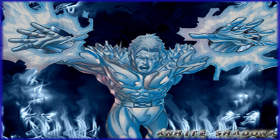
Not too sure about the font/font color...
Took me a LONG ASS TIME to make the background at least 1 and a half hours, easily more...
------------------------------------------------
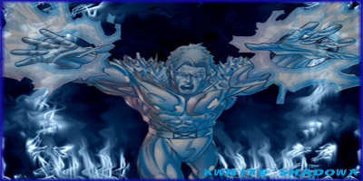
Remade - Rasterized text and added effects/changed main color
------------------------------------------------
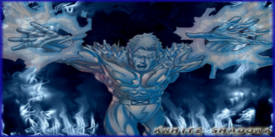
Adjusted Contrast and Opacity of Iceman
+ Reply to Thread
Results 1 to 10 of 10
Thread: ~ IcemaN SiG ~
Threaded View
-
08-14-2008 #1
- Join Date
- Jan 2008
- Location
- Your mom's fresh shaven Cun+.
- Posts
- 2,598
- Points
- 6,927,067.43
- Rep Power
- 237
 ~ IcemaN SiG ~
Last edited by xWhite_Shadowx; 08-14-2008 at 08:40 AM.
-
08-14-2008 #2
- Join Date
- Jan 2008
- Location
- PA
- Posts
- 1,164
- Points
- 8,075,913.25
- Rep Power
- 233
its ok looks like u put time into it im just not my taste

Get Vip: »Here«
Donate: »Here«
>>List of Compilers<<
>>SFDM Name Generator<<
[Owner Of FluidCoding]
-
08-14-2008 #3
- Join Date
- Apr 2008
- Posts
- 23
- Points
- 70,851.00
- Rep Power
- 222
its good but sigs sizes shouldnt be any bigger than 450 by 150, and also you need a lightsource in that sig with some contrast
-
08-14-2008 #4
- Join Date
- Jan 2008
- Location
- Your mom's fresh shaven Cun+.
- Posts
- 2,598
- Points
- 6,927,067.43
- Rep Power
- 237
-
08-14-2008 #5
- Join Date
- May 2008
- Location
- In the interwebz
- Posts
- 5,057
- Points
- 4,552,690.99
- Rep Power
- 244
Nothing wrong with 400x200 Originally Posted by -Waz-

You should of seen it before i told him to change it, it was like 438x400
-
08-14-2008 #6
- Join Date
- Apr 2008
- Posts
- 23
- Points
- 70,851.00
- Rep Power
- 222
lol a square, yea just saying most sigs ive seen arent any bigger than 450 by 150
-
08-14-2008 #7
- Join Date
- Jul 2008
- Posts
- 849
- Points
- 1,284,840.78
- Rep Power
- 220
400x200 isnt a sqaure :S
and generally, 400x200 is the largest sig size u'll find......thats the size ALL my sigs are unless i want to scale them down in the final stages :P
anyhow
onto this one....
the text is still meh.....
when it comes to text, SIMPLE is BEST
use something like Arial or Times New Roman. Dont go with fancy shizz like monotype corsorvia or other weird ones :P
placement of text is also key
put it close to the focal, but not too close or too far away. It should distract from the focal......text should add to the sig
another point....
try and make ure focal a part of the bg.....
intergrate it into the background to give the sig depth....
for example, i see that u smudged (i think) at the bottom and made some fire-like shapes.......if u were to smudge OVER his legs (at the bottom of the sig of course) and make it look like he is behind the flames, u can begin to introduce some depth. ATM, it seems kinda.....well......flat, i guess :P
point 3.....
colours....
try and widen the colour range.....
this is actually quite easy......
click on layer>adjustment layer.....
from there, u will see a whole range of differant layers u can add......
for the stage that ure at, the 'Colour Balance' adjustment layer will be most helpful to u.....
mess with the settings. change the colours of the shadows, highlights and the midtones.....when u start to feel a little bit more confident with the colour have a go at messing with the other adjustment layers....
also, look at the blending modes......

that is a screenshot of where u can change them from. changing the blending modes will give differant effects and add/lose colour in the sig depending on the opacity of the layer aswell
see, with this sig, i think it could also do with more things.
download and install some brushes from www.deviantart.com
just search them.......that is also a really good site for tutorials, so if ure ever stuck, just search on there.....
yeah....
anyhow, get some brushes that u like the look of and just mess with them.....
brush star's or whatever else u think looks good. again, messing with the blending mode will change how the stars and whatever other shizz u have look.....
sorry for the essay.... :P
lol
its up to u if u read it or not, but i hope it helps.....
when it comes to improving, u can do it in two ways......
either improve each small aspect one at a time (eg, in the next sig, give perfect text or make a really good BG - this one is pretty sweet btw ;)) OR you can take it head on and just go mad (eg. try EVERYTHING i just told u :P)
yeah.....
thats it i guess :P~Shoot~

(\__/)
( >_>)
(')_( )
and shes 13
Originally Posted by floppybunny
-
08-14-2008 #8
- Join Date
- May 2008
- Location
- In the interwebz
- Posts
- 5,057
- Points
- 4,552,690.99
- Rep Power
- 244
When waz said square he was talking about the earlier version I mentioned that was something like 438x400 (which is still not a square but close).. It's called a joke

Oh and that pic got owned =D
-
08-14-2008 #9
- Join Date
- Jan 2008
- Location
- Your mom's fresh shaven Cun+.
- Posts
- 2,598
- Points
- 6,927,067.43
- Rep Power
- 237
thanks MZA and i did read it all ill try your smudging technique and integrate iceman into the bg, and i already installed alot of brushes (including the stars one)
-
08-15-2008 #10
- Join Date
- Jul 2008
- Posts
- 849
- Points
- 1,284,840.78
- Rep Power
- 220
np bro
~Shoot~
(\__/)
( >_>)
(')_( )
and shes 13
Originally Posted by floppybunny


 Reply With Quote
 Posting Permissions
- You may not post new threads
- You may not post replies
- You may not post attachments
- You may not edit your posts