


idk i dont really like it but oh well

+ Reply to Thread
Results 1 to 7 of 7
Thread: The Dark Knight sig
Threaded View
-
08-03-2008 #1
- Join Date
- Feb 2008
- Posts
- 1,256
- Points
- 2,006,015.67
- Rep Power
- 227
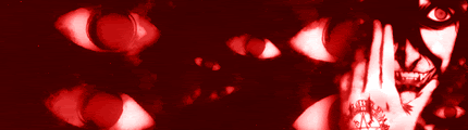
 The Dark Knight sig
Thanks Dillon_Ritual

Thanks CEREAL_MAN!

Thanks xWhite_Shadowx
Thanks CEREAL_MAN/J3LLO
Thanks +Mw.Kat~AV
Thanks STOP_B
Thanks MZA
Thanks -Sя.DoubleU
My Photobucket URL: http://photobucket.com/floppy
1000th Post!: http://www.codinghs.com/forums/showp...39&postcount=3
-
08-03-2008 #2
- Join Date
- Jul 2008
- Location
- Phoenix, AZ
- Posts
- 1,932
- Points
- 5,670,787.02
- Rep Power
- 229
wow thats a really nice sig floppy. you should put you name like floppy in one wing of the bat and bunny in the other that would be cool. did you make it? or did somebody make it for you?
-
08-03-2008 #3
- Join Date
- Jul 2008
- Posts
- 206
- Points
- 258,982.00
- Rep Power
- 219
its cool but something is lacking........
-
08-03-2008 #4
 GFX MASTER! BOW DOWN
Elite Contributor
GFX MASTER! BOW DOWN
Elite Contributor

- Join Date
- Apr 2008
- Location
- N0T NEAR Y0U
- Posts
- 1,512
- Points
- 3,639,108.70
- Rep Power
- 227
the bat looks a little bad


-
08-04-2008 #5
- Join Date
- May 2008
- Location
- In the interwebz
- Posts
- 5,057
- Points
- 4,552,721.99
- Rep Power
- 244
:S Well... It's not your best work...

-
08-04-2008 #6
- Join Date
- Jul 2008
- Posts
- 849
- Points
- 1,284,844.78
- Rep Power
- 220
the bat in the BG looks somewhat choppy in areas....
may i ask how u cut it out???
also, this sort of style isnt really what i like.......
it just seems......bland.....
what u could do is make it so its more like the 2nd sig (in ure current)....
limit it with a canvas and FILL UP the canvas......
add a city in the BG (thats blurred)....
just go a little crazeh ~Shoot~

(\__/)
( >_>)
(')_( )
and shes 13
 Originally Posted by floppybunny

-
08-04-2008 #7
- Join Date
- Feb 2008
- Posts
- 1,256
- Points
- 2,006,015.67
- Rep Power
- 227
thanks guys for the suggestions! yeah i made it but in a hurry to post it and get opinions, i forgot to put my name on it
Thanks Dillon_Ritual
Thanks CEREAL_MAN!
Thanks xWhite_Shadowx
Thanks CEREAL_MAN/J3LLO
Thanks +Mw.Kat~AV
Thanks STOP_B
Thanks MZA
Thanks -Sя.DoubleU
My Photobucket URL: http://photobucket.com/floppy
1000th Post!: http://www.codinghs.com/forums/showp...39&postcount=3
 Reply With Quote


 Posting Permissions
- You may not post new threads
- You may not post replies
- You may not post attachments
- You may not edit your posts